If you closed your eyes and imagined a Coca-Cola bottle, chances are the color red flashes before anything else. For generations, that red has done more than stand out—it’s become part of our cultural shorthand for refreshment. But Coca-Cola’s red wasn’t always a branding default. In fact, the earliest Coke containers weren’t even red at all.
This article uncovers how Coca-Cola came to embrace its bold red identity—and why that color has stuck around for over 80 years. Spoiler: it has more to do with customs officials, consumer psychology, and brand discipline than any artistic whim.
Let’s rewind to the late 1800s. Back then, Coca-Cola wasn’t sold in bottles but shipped in barrels—just like whiskey and rum. This posed a problem. Alcohol was taxed by the US government. Coca-Cola, classified as a non-alcoholic beverage, was not. But customs agents had a hard time telling the difference.
To sidestep unnecessary inspections and delays, Coca-Cola began painting its barrels red to differentiate them from alcohol shipments. That red wasn’t a branding move. It was a logistical workaround. A practical visual cue that said, “This is soda, not spirits.” And yet, that red paint would soon become the visual bedrock of a global brand.
Even if the origin was administrative, Coca-Cola’s red turned out to be a marketing win. Decades later, food psychology would confirm that red stimulates appetite and draws attention—especially in consumer settings. It’s why so many brands in the food and beverage space (think McDonald’s, KFC, and Heinz) also use red in their logos and packaging.
Red is warm, urgent, and emotional. It triggers excitement and salience. That’s powerful on a store shelf, vending machine, or billboard. Coca-Cola may have stumbled into it, but the company’s continued embrace of red shows a deep understanding of how color shapes perception.
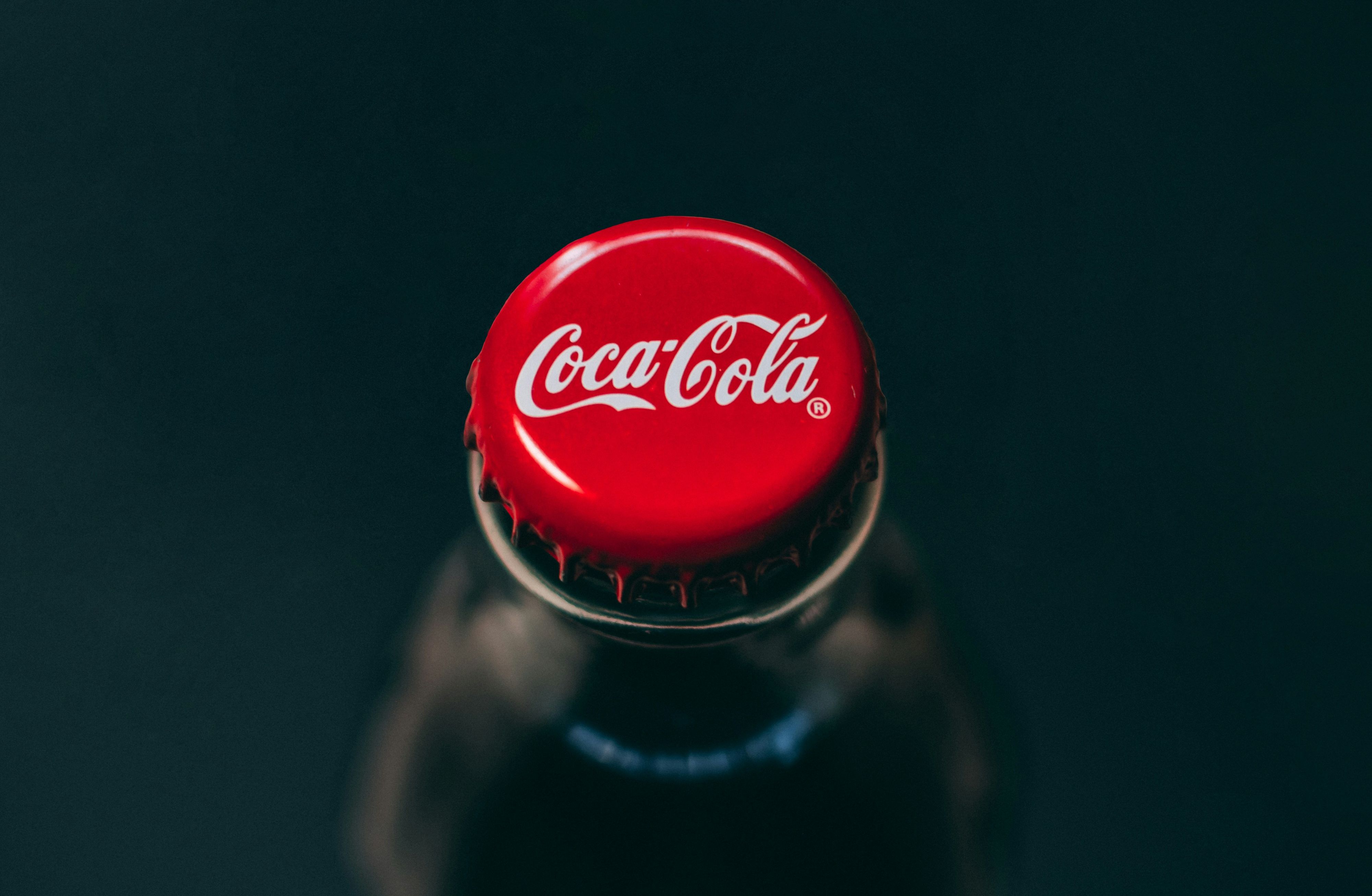
While the red built early recognition, the iconic script made it unforgettable. In 1887, Frank M. Robinson—Coca-Cola’s bookkeeper and resident marketing mind—designed the logo using Spencerian script, a popular handwriting style of the day. He believed the two capital “C”s would catch the eye in advertisements, especially in newspapers and storefront signage.
Over time, Coca-Cola paired that elegant script with a bold red background. Sometimes it was red-on-white, other times white-on-red. But the combination—fluid cursive and assertive red—cemented itself as one of the most recognizable visual identities on Earth.
Ask a casual Coke fan why the brand is red, and you might hear about Santa Claus. It’s a story repeated often: Coca-Cola “created” the modern image of Santa in a red suit, and in doing so, standardized red as part of the brand. That narrative isn’t quite accurate. Santa Claus imagery had already evolved by the time Coca-Cola’s ads popularized him in the 1930s. But those festive campaigns—featuring a jolly Santa in Coca-Cola red, drinking a chilled bottle—did solidify the emotional tone of the brand: cheerful, trustworthy, indulgent.
The real strategic move came in 1941. That’s when Coca-Cola made the red logo official and permanent. From that point forward, the color wasn’t just an aesthetic or a holiday gimmick—it was institutional.
Coca-Cola has introduced many product lines over the years: Diet Coke, Coke Zero, flavored colas, and caffeine-free variants. Each comes with its own color: silver, black, green, or gold. But the core Coca-Cola always returns to red. That consistency isn’t accidental—it’s part of what the company calls its “one-brand strategy.” It’s a way to anchor all its variations under a central, recognizable brand identity.
Even international packaging tweaks—such as yellow caps in kosher markets or Arabic-script labels in the Middle East—keep red as the dominant hue. That kind of consistency is rare, especially in a consumer landscape where logos morph by the season.
Color, for Coca-Cola, isn’t just design. It’s a form of communication. Former Coca-Cola archivist Ted Ryan once said: “You see a red disc icon on a storefront, and you know that you’ll be able to get delicious, ice-cold Coca-Cola there.” That’s the power of visual shorthand. In the same way the golden arches imply fast food, or Tiffany blue implies luxury, Coca-Cola red signals availability, reliability, and satisfaction.
This isn’t nostalgia. It’s strategic use of color as mental shortcut. In marketing psychology, this is called “color branding,” and Coca-Cola is one of the most successful examples in history. You don’t need to read the word “Coca-Cola” to know what the product is. The color alone does much of the work. Over the decades, Coca-Cola’s logo has undergone dozens of small adjustments: changes in the swirl, the spacing between letters, and how the hyphen sits between “Coca” and “Cola.” The punctuation has come and gone. The shape around the logo—whether a ribbon, rectangle, or swoosh—has evolved with the times. But the red? It hasn’t budged.
That level of design discipline is rare in modern branding. Companies often feel the urge to update, rebrand, or disrupt themselves visually. Coca-Cola has resisted that temptation. And it’s paid off in brand equity. A 2023 study by Brand Finance still ranked Coca-Cola among the top 10 most valuable brands globally, with its visual identity cited as a core contributor.
Coca-Cola red has outgrown its marketing origins. Today, it functions almost as a cultural marker. It shows up in pop art (see: Andy Warhol), in protest symbolism (Coke bottles used in anti-capitalist street art), and in nostalgia-driven ad campaigns from South America to Southeast Asia.
It’s a rare example of a corporate color becoming part of the emotional texture of daily life—embedded not just in advertising but in memory, ritual, and even language. (“Crack open a Coke” has entered the idiom in dozens of countries.) That red shade isn't just doing business. It’s doing culture.
It started as a tax workaround. It became an appetite stimulant. It evolved into a brand anchor. And today, it endures as a global cue for trust, familiarity, and simple indulgence. The Coca-Cola logo is red not because it had to be—but because it turned out to be the smartest design decision in beverage history. What began as a barrel paint hack now functions as one of the most effective visual signals in the modern consumer world. And in a digital age of rebrands and trend-chasing, Coca-Cola’s commitment to red is proof that sometimes, the best brand moves are the ones that stay the same.
Design trends come and go, but Coca-Cola red reminds us: the most powerful brand stories aren’t created—they’re remembered. In a world where companies refresh their logos every few years and chase micro-trends for social media relevance, Coca-Cola’s consistency offers a different kind of lesson. It’s not about staying trendy—it’s about staying legible. The red isn’t just design. It’s muscle memory. It’s the reason a bottle on a dusty roadside shelf in Southeast Asia or a crowded New York subway vending machine still feels instantly familiar.
That kind of recognition doesn’t happen through novelty—it happens through trust built over time. Coca-Cola’s red is shorthand not just for the drink itself, but for a particular kind of emotional recall: childhood summers, long drives, parties, holidays, vending machines after school. It’s a color that carries experiences.
And while algorithms today may reward reinvention, the human brain still rewards familiarity. Red makes us look, but repetition makes us remember. Coca-Cola figured that out long before branding became a science—and doubled down on a color that now does the work of a thousand campaigns. In that way, Coca-Cola’s red is less about aesthetics and more about memory architecture. It’s not just brand color—it’s brand permanence.