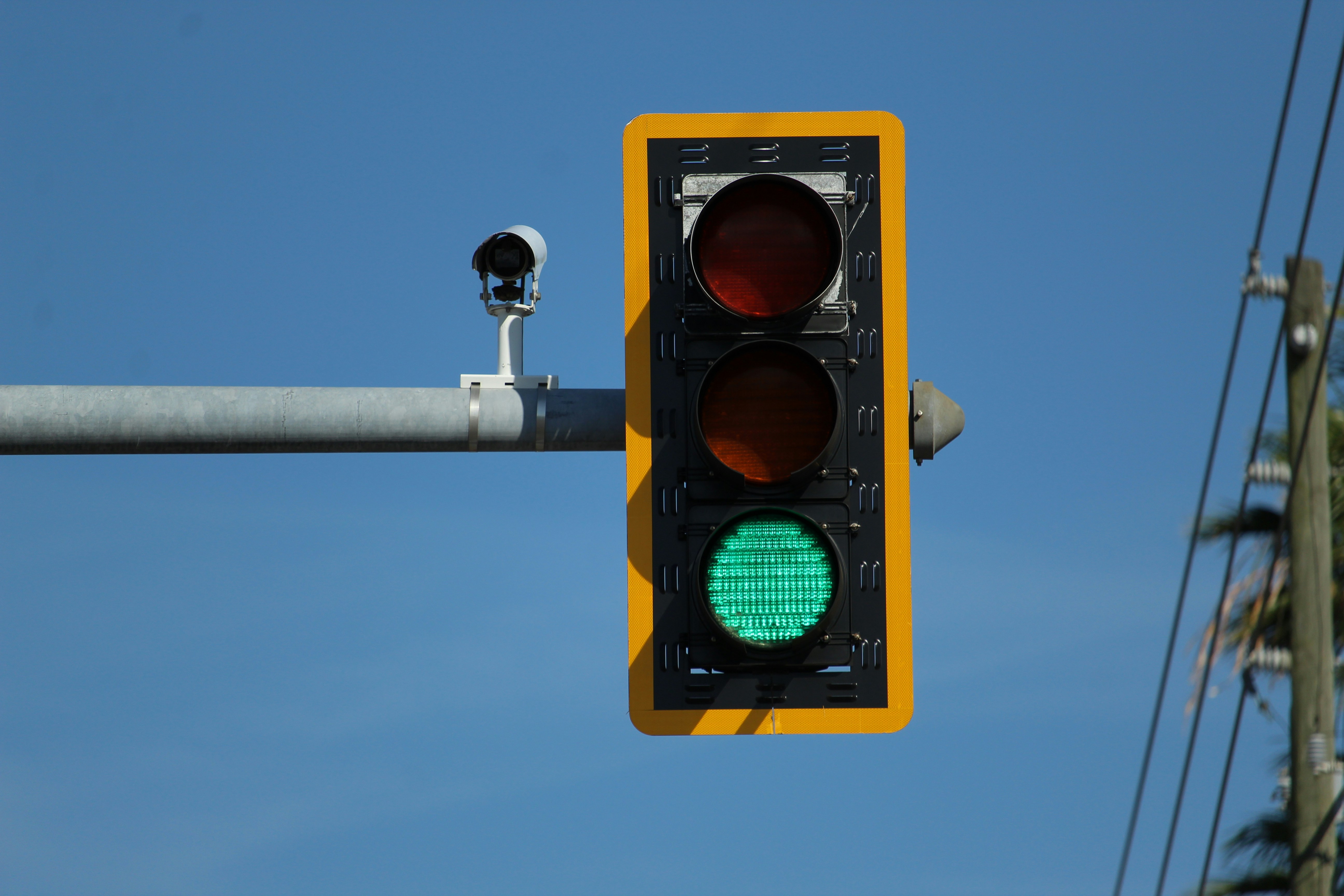
Most of us drive or walk past traffic lights every day without thinking twice. We know the rules instinctively—red means stop, green means go, yellow means slow down. But few of us ever pause to ask: Why those colors? Why not blue for stop, or purple for go?
As it turns out, there’s a system behind the signal. One built not just for functionality, but for visibility, psychology, and historical continuity. Understanding how this color trio became the global standard reveals something deeper about how we move, how we design for safety, and how small decisions shape the world at scale.
Before cars roared down highways, railroads crisscrossed cities and countrysides. Trains were among the first vehicles to demand systematized traffic management. And it was the railway industry that first adopted colored lights to guide movement.
In the 19th century, early rail signals used red for stop, green for caution, and white for go. But white lights turned out to be problematic—too easily confused with stars, lanterns, or other ambient sources. Train engineers misread signals. Accidents happened. The fix was simple but profound: swap green in for "go," and yellow took the place of "caution."
By the time cars entered the scene, this color logic had already hardened into convention. Red, yellow, and green made the leap from train tracks to city streets. But why these colors? Why did they work so well that we still use them, virtually unchanged, more than a century later?
Red is a color we are biologically primed to notice. It carries the longest wavelength in the visible light spectrum, meaning it travels far and scatters less. That’s why sunsets turn crimson, and why red can be seen from a distance even in low-light or smoggy conditions.
Psychologically, red communicates urgency. It increases heart rate and triggers a state of alertness. In nature, red often signals danger or toxicity—think of venomous animals or the flush of anger. That instinctual response makes it an ideal choice to command attention and halt motion.
In traffic light design, red isn’t just about visibility—it’s about a biological cue to pause. And that’s the genius of it: a design choice that’s rooted in both physics and psychology.
While red screams caution, green soothes. Nestled in the middle of the visible light spectrum, green is the color most easily detected by the human eye. Our retinas are built to register it with clarity, making it a practical pick for a signal you want drivers to spot quickly and interpret as safe.
From a symbolic perspective, green has long signaled growth, permission, and forward movement. In ancient cultures, it was associated with fertility and harmony. In modern contexts, it telegraphs calm and control. That makes it the perfect visual invitation to proceed with confidence.
It’s worth noting that green wasn’t always the color of “go.” Early railways used white until, as noted earlier, confusion created too much risk. Once green replaced white, it carried over to car traffic—and it stuck.
Yellow (or amber, if you're technically inclined) plays a quieter but no less important role in the stoplight system. It is, quite literally, the space between. Neither a full stop nor a greenlighted go, it signals anticipation, urging drivers to slow down and prepare for change.
Yellow has one of the highest visibility levels of any color—think warning signs, school buses, and hazard lights. It stands out in rain, fog, and low contrast. But beyond being eye-catching, yellow strikes a balance. It communicates “caution” without inciting panic. That balance is essential for intersections, where timing matters down to the second.
The introduction of the yellow light was a design fix. In the 1920s, traffic engineers noticed that going straight from red to green (and vice versa) left too much room for collision. Drivers accelerated too early or too late. Yellow created a transition moment—a design pause that saved lives.
There’s an elegant system behind this color selection. Red travels far. Green is easiest to see. Yellow is the perfect bridge. But even beyond the physics, the sequence reflects a logic of human behavior: a stoplight isn't just telling cars what to do. It’s anticipating how people respond under pressure.
In a world where urban planning often struggles to keep up with human complexity, the traffic light is a rare example of a simple solution that scaled. It works across cities, climates, and cultures. That consistency creates not just safety—but confidence. You know what to do at an intersection in Kuala Lumpur, Chicago, or Madrid.
The US didn’t always have standardized traffic light systems. In the early 1900s, cities experimented with different colors, patterns, and even auditory signals. It wasn’t until 1935 that the Federal Highway Administration created the Manual on Uniform Traffic Control Devices (MUTCD), requiring red, yellow, and green nationwide.
This move toward regulation reflects a broader truth: for systems to scale safely, they must be consistent. The success of the traffic light isn’t just due to color theory. It’s due to its predictability. In design, that’s often the difference between novelty and infrastructure.
Other countries adopted similar standards over time, making the red-yellow-green trio a rare example of global consensus in public design.
Today, traffic lights are more than safety devices—they’re unconscious rituals. We don’t think about them unless they malfunction. That’s the mark of good system design: when it works so seamlessly, it becomes invisible.
But when we do pause to look up—at the glowing red above us or the beckoning green—we’re seeing more than just lights. We’re seeing a history of adaptation. A translation of natural instinct into engineered response. A system that respects both physics and emotion, biology and behavior. And that’s what makes traffic lights enduring: not their simplicity, but their layered intelligence.
In a world chasing smart sensors, autonomous vehicles, and AI-driven infrastructure, the red-yellow-green stoplight reminds us that sometimes, the smartest systems are the simplest. They’re not flashy. They don’t need to be. They just need to work—reliably, humanely, and across time.
The next time you're waiting at a red light, take a breath. That pause is doing more than keeping you safe. It’s connecting you to over a century of design decisions made for clarity, safety, and trust. Sometimes, the most powerful systems are the ones we hardly notice.