
It’s easy to overlook. You’re in traffic, shifting lanes to let an ambulance pass, and the moment feels purely functional: make space, wait for the sirens to fade, carry on with your day. But if your eyes catch it—the blue, six-pointed star on the side of that speeding emergency vehicle—you might find yourself quietly wondering what it means. It’s one of those symbols we all see but rarely stop to decode. Yet, the Star of Life is anything but arbitrary. It’s one of the most universally recognized—and deeply layered—icons in modern healthcare. A symbol that signals help is coming, systems are in place, and someone knows exactly what to do when a crisis unfolds.
The Star of Life wasn’t always a fixture on ambulances. It came into being not because someone wanted a visual logo for medical drama, but because America needed a system. In the mid-20th century, as highways sprawled and cars became faster and more dangerous, the rate of road accidents spiked. People were dying—not just from crashes but from delays in receiving care. President Lyndon B. Johnson, in response to growing concern over public safety, signed the Highway Safety Act in 1966. It wasn’t a sexy piece of legislation, but it laid the foundation for the modern Emergency Medical Services (EMS) system. Alongside better traffic rules and road designs, it proposed something surprisingly profound: consistency. America needed a way to train EMTs, standardize ambulance protocols, and identify which vehicles were actually prepared to deliver life-saving care.
Around that same time, another movement was unfolding—one with ancient roots. The American Medical Association had already been using a medical alert symbol, based on the Rod of Asclepius, the Greek god of medicine. The original design featured a single snake coiled around a staff, encased in a six-pointed star with a hexagonal border. It was first meant to help people with serious medical conditions like epilepsy or diabetes carry identification in emergencies. It wasn’t flashy or proprietary. In fact, the AMA encouraged widespread use of the symbol, and by 1964, it had been adopted by the World Medical Association as a kind of open-source emergency medical ID.
But this older symbol lacked regulatory power. Anyone could print it on a card. What the Department of Transportation wanted—what public safety officials needed—was something that could signal official capacity. A symbol that said: this vehicle meets federal standards. These people are trained. You can trust this system. By 1977, that symbol had emerged in its now-familiar form: a solid blue six-pointed star, stripped of its border, trademarked by the National Highway Traffic Safety Administration (NHTSA), and known officially as the Star of Life.
The symbol became a visual contract between institutions and the public. Ambulance manufacturers who met rigorous federal requirements could display the star on their vehicles. Those requirements went far beyond aesthetics: they covered compartment size, oxygen storage, medical equipment readiness, seating configuration, climate control, lighting, even how easy it is to sanitize the space after use. This wasn’t just about building a better van. It was about creating a rolling system of care—one that didn’t fall apart under pressure.
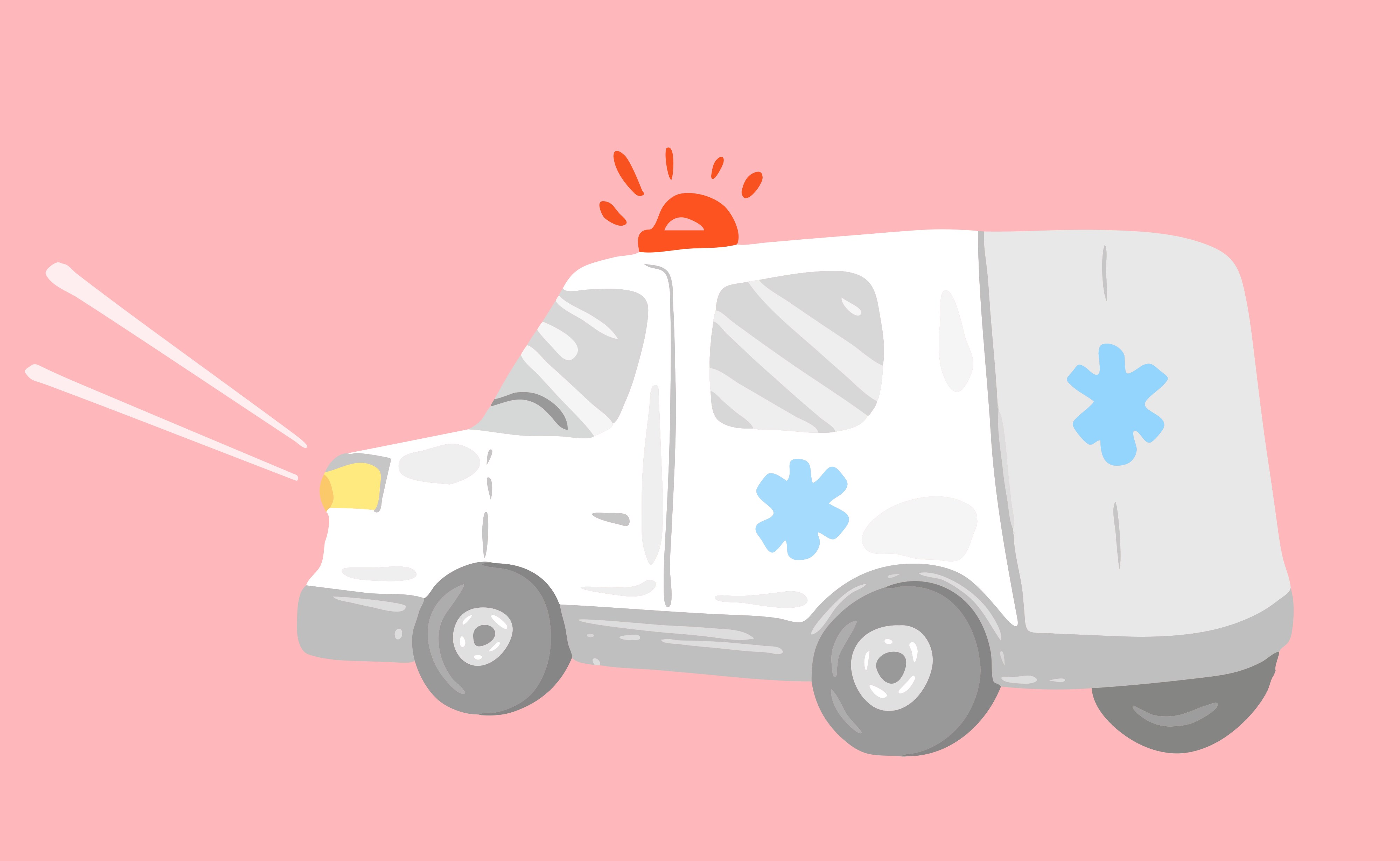
Each of the six bars in the Star of Life has meaning, though you wouldn’t know it at a glance. Together, they trace the full path of an emergency response: from initial detection, to the call for help, to rapid response and on-scene stabilization, followed by transport and finally the handoff to definitive care at a hospital. It's a complete cycle, rendered in geometry. In a world where everything from logos to slogans tends to overpromise, the Star of Life has a quiet integrity. It says exactly what it needs to say: care is coming, and it’s coordinated.
But it’s the center of the symbol—the rod and the serpent—that gives it something more. Something older. Something almost spiritual. In mythology, Asclepius was the son of Apollo and a mortal woman. He was raised by a centaur and learned the art of healing so well that, according to legend, he could bring the dead back to life. The gods, threatened by this breach of natural order, struck him down. Yet his staff, entwined with a single snake, endured. The snake wasn’t just decorative. It represented renewal, transformation, the cycle of shedding and becoming. It’s a symbol of medicine that has persisted for thousands of years, across continents and cultures. Today, it sits at the heart of modern emergency services, reminding us that even in our most clinical systems, there is mythology. There is history. There is hope.
What’s fascinating is how the Star of Life has transcended its original use. You’ll find it on highway signs pointing to the nearest emergency room. On medic alert bracelets. On field kits used by paramedics. In some countries, it’s printed on hospital signage or school health posters. It’s even entered the language of pop culture—a silent, visual shorthand for emergency care, professionalism, and rapid response. While it originated in the US, the Star of Life has become a global signifier. The fact that a symbol born in government memos and highway policy now sits at the intersection of myth and function speaks volumes about its resonance.
And yet, unlike a red cross or a corporate logo, the Star of Life isn’t just ornamental. It has regulatory teeth. Not every ambulance is allowed to wear it. That’s because not every ambulance meets the standards. Some private vehicles offer transport but not true EMS. Others may operate outside regulated jurisdictions. The presence—or absence—of the Star of Life can tell you at a glance whether the vehicle is part of the official emergency response system. It’s one of those small signals that most people never think to question. But once you know, you see it differently. The star becomes a kind of visual truth: are we inside the system or not?
That’s the thing about symbols. We live in a time of visual overload—logos, badges, branding marks are everywhere. But not all symbols carry real meaning. Some are about aesthetics. Some are about ownership. Very few are about function. Fewer still are about trust. The Star of Life, in its quiet way, has become one of the rare icons that doesn’t just say something. It does something. It tells us we are being seen. That the system is showing up. That order exists, even in the chaos of flashing lights and racing hearts.
Interestingly, it’s a symbol born of bureaucracy, but it carries something almost sacred. It doesn’t need neon or animation to catch your eye. It doesn’t need to sell you anything. It shows up in the moment you’re most vulnerable—on a stretcher, in a crash, watching someone you love struggle to breathe—and says, without fanfare: we know what to do.
And maybe that’s why the Star of Life sticks with people. It doesn’t ask for attention, but once you notice it, it becomes unforgettable. You start spotting it on road signs and on the sleeve patches of paramedics. You might catch it on a subway ad for CPR training, or a weathered sticker on a supply kit at a music festival. It travels well. It blends in. But it never disappears.
In a cultural moment where so much is performative—where identity is branded and trust feels fleeting—the Star of Life remains quietly practical. It doesn’t offer inspiration. It offers coordination. Training. Equipment. Standards. And for all the mythology packed into its design, it’s grounded in real-time execution. No wonder it’s lasted.
What’s also worth reflecting on is how this one symbol connects so many layers of our world. It bridges ancient belief with modern regulation. It lives on metal doors and in legal documents. It exists in both public memory and federal safety code. It reminds us that care, when done right, is not just about speed. It’s about structure.
It’s also about who gets to be part of that structure. While ambulances with the Star of Life must meet strict standards, there’s still variability in access to emergency care. In rural areas or lower-income regions, vehicles may lack certification. In conflict zones, the symbol may appear on makeshift transport units as a sign of hope, even if the infrastructure behind it is fragile. So while the Star of Life conveys readiness, it also exposes disparity. Not every flashing light guarantees a full care protocol behind it. Not every blue star is backed by the system it represents.
Still, the presence of the symbol does something important. It invites accountability. It gives the public a way to recognize what certified emergency care should look like. And it sets a bar. One that other countries, other systems, other generations can build toward.
In a way, the Star of Life is both a map and a mirror. It maps the journey of emergency response—from detection to definitive care. And it mirrors our collective attempt to bring order to chaos, to bind ancient understanding with modern logistics, to create systems that are legible, trustworthy, and human-centered.
That’s not just clever design. That’s culture. Infrastructure. Storytelling, even.
Because symbols aren’t just things we look at. They’re things we look through. They shape how we see systems. How we trust people. How we respond under pressure. The Star of Life does all of that, without ever needing a tagline.
So the next time an ambulance passes by—lights flashing, star gleaming—pause, if only for a second. Not out of superstition. Not out of fear. But because in that blue geometry lies a promise: someone trained is coming. A system exists. You are not alone.
And in a world where certainty often feels like a luxury, maybe that’s the most comforting symbol of all.


